Prototyping
Nobody reads the manual
People try things before they read anything. Hand a prototype to someone new, keep quiet and watch, and you'll see where the product has to explain itself.
You've probably pushed a door that was meant to be pulled. Almost everyone has. It's a small mistake, but the awkward feeling that follows is familiar. The problem, however, isn't necessarily the person. It's the door.
A handle you can grab suggests pulling. Put that handle on the push side, and the design gives you the wrong instruction. Products communicate in much the same way.
People rarely read the manual before using something new. They pick it up, look for familiar controls and follow the clues the design gives them. When those clues are misleading, even a simple product can become frustrating.
One of the easiest ways to discover what your product communicates is to put a prototype in the hands of someone who's never seen it. Give them a task, say as little as possible and observe what happens.
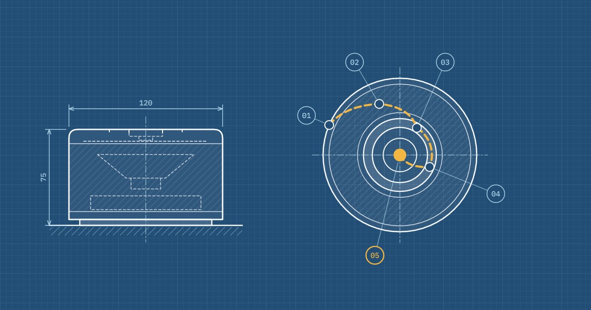
Consider a fictional example: a small battery-powered speaker designed for the kitchen or garden. It has a single round button on top, surrounded by a ring of light. The tester is a neighbor who has never used it before. Their only instruction is simple: "Play a song from your phone."
The neighbor picks up the speaker, examines it and turns it over, looking for a way to switch it on.
The power button is flush with the surface and blends into the surrounding material. Instead, they press the light ring. It looks like a control, perhaps even a dial, but nothing happens.
Eventually, they find the button and press it. Still nothing.
The speaker requires a three-second press to switch on, but there's no indication of this. Without any feedback, three seconds feels surprisingly long. The tester has no way of knowing whether they're doing the right thing.
The ring lights up blue. The neighbor opens the Bluetooth settings on their phone and looks for the speaker, but it isn't there.
Pairing mode requires another long press. Only then does the light begin blinking blue instead of glowing steadily. The difference is explained in the manual, but nothing on the speaker makes it obvious.
Then the neighbor says something revealing:
"Sorry, I'm usually good with these things."
It's a familiar response. When people struggle with a product, they often assume they're doing something wrong. Ask them afterwards, and they may even describe the experience as easy.
That's why observation matters. What people actually do often reveals more than what they remember or report.
Eventually, the music starts playing.
The neighbor tries to increase the volume by turning the light ring. It looks like something that should rotate, so the assumption makes sense. But the ring isn't a control. Volume can only be adjusted on the phone.
A little later, the ring turns red. The neighbor interprets this as an error and switches the speaker off.
The red light was intended to indicate a low battery. To the designer, its meaning was obvious. To someone encountering the product for the first time, it suggested that something had gone wrong.
In roughly six minutes, this fictional test has revealed five opportunities to improve the design:
- Make the power button easy to find and identify by touch.
- Provide immediate visual or audible feedback when the button is pressed.
- Make the speaker discoverable over Bluetooth when it's first switched on.
- Redesign the light ring so it doesn't suggest a rotating control.
- Communicate a low battery without making it look like a malfunction.
None of these changes requires a technological breakthrough. At the prototype stage, most would be relatively inexpensive to implement.
Once the product is manufactured and shipped, however, the same problems become much more costly. They can lead to support requests, negative reviews, returns and potentially even hardware revisions.
More importantly, these issues might never have surfaced during an internal design review. Everyone involved in developing the speaker already knows how it works. They know where the button is, why it needs to be held and what the different lights mean.
That knowledge makes it difficult to see the product through someone else's eyes.
Designers and engineers are rarely good substitutes for first-time users of their own products.
They've spent weeks or months making decisions about the controls, interactions and behavior. What feels intuitive to them may only feel that way because they already understand it.
The same applies to colleagues who've followed the development process. Even if they haven't worked directly on the product, they've probably absorbed enough information to influence how they use it.
For a genuine first-use test, you need someone unfamiliar with the design.
You also need fresh participants after making changes. Someone who's already used the speaker can give valuable feedback on repeated use, but they can no longer reproduce the experience of encountering it for the first time.
You don't need a laboratory, expensive equipment or a finished product. A simple prototype and a few people unfamiliar with the design can reveal a great deal.
- Give people a task, not instructions. "Play a song from your phone" describes the goal. "Hold the button until the light blinks" tells them how to achieve it. The distinction matters because you're testing whether the product communicates the necessary steps on its own.
- Encourage people to think aloud. Ask them to describe what they're looking for or expecting. Then resist the urge to help. Every explanation you feel tempted to give is a potential sign that the design needs to communicate something more clearly.
- Pay attention to what they do. Watch where their hands go, which controls they try and where they hesitate. A finger hovering over the wrong button can reveal a usability issue before the person says a word.
- Test with a small group, then iterate. Around five participants is often a useful starting point for identifying recurring usability problems, although more may be needed for complex products or different user groups. Fix the issues you discover, then test the updated design with new people.
- Start with whatever you can prototype. A 3D-printed enclosure with a working button may be enough to test whether people understand how to switch something on. You don't need finished electronics to evaluate every interaction.
The objective isn't to prove that people can use your product. It's to find out where the design makes them stop, guess or misunderstand.
A good product should communicate as much as possible through its design. Its shape, controls, feedback and behavior should help people understand what to do without requiring an explanation.
Manuals still have an important role, particularly for safety, maintenance and advanced functionality. But when a basic interaction requires written instructions, it's worth asking whether the design could make that interaction clearer.
The earlier you discover these problems, the easier they are to address. A change that takes an afternoon on a prototype might require an expensive redesign after production begins.
That's why we build prototypes that can be tested with real people, observe how they interact with them and use what we learn to improve the next iteration.
Tell us what your product should do, and we'll help identify what is worth testing first.